Challenge
Rebranding a 20-year-old commercial landscaping company serving Las Vegas presented a unique hurdle. Their name, “Valley Green,” traditionally evokes water-heavy lawns, which contradicts modern desert conservation. The challenge was shifting their visual narrative toward sustainable, drought-tolerant xeriscaping without losing their established corporate authority. I needed a mark that felt both premium and deeply rooted in responsible desert architecture.
Process
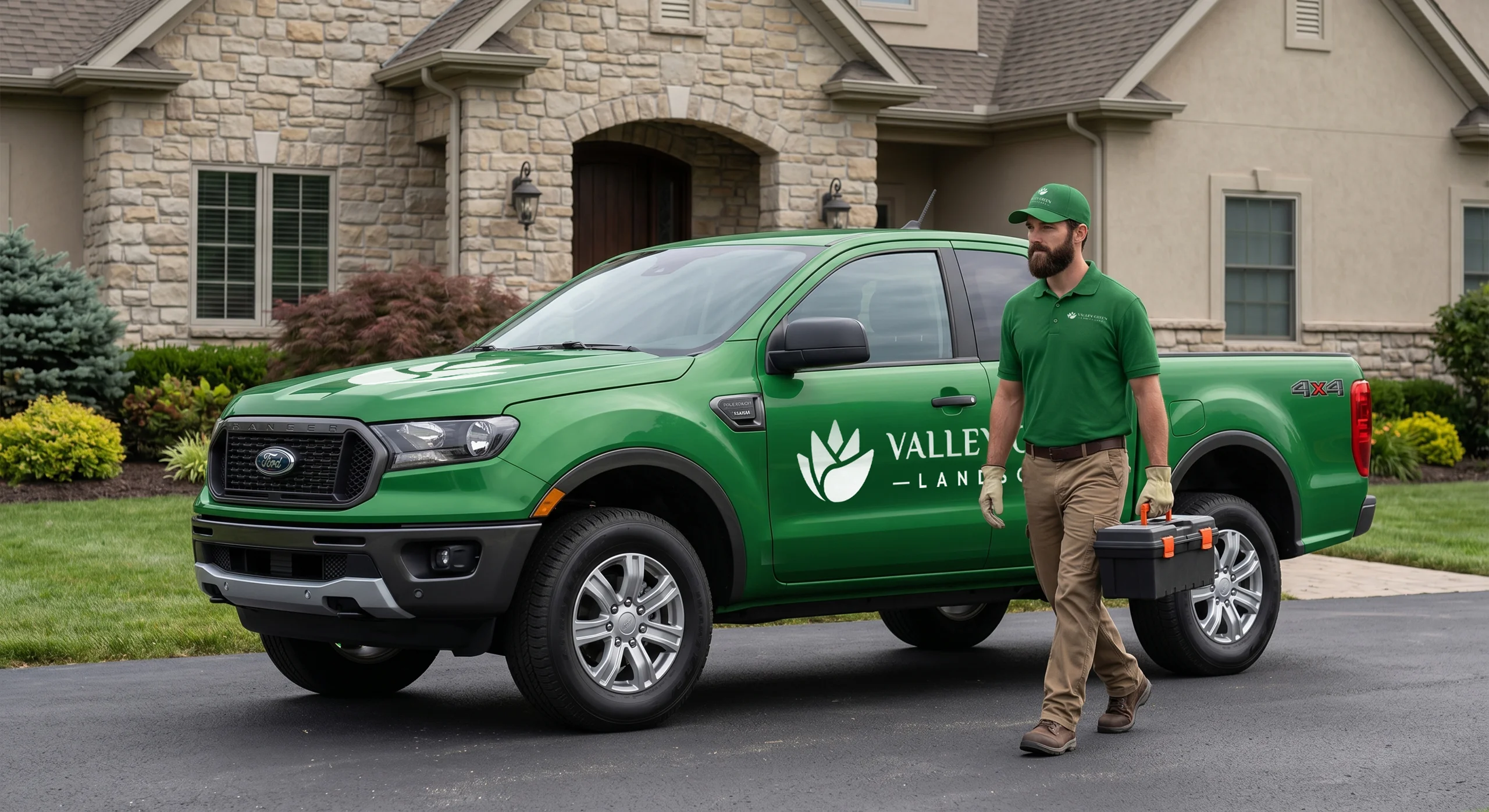
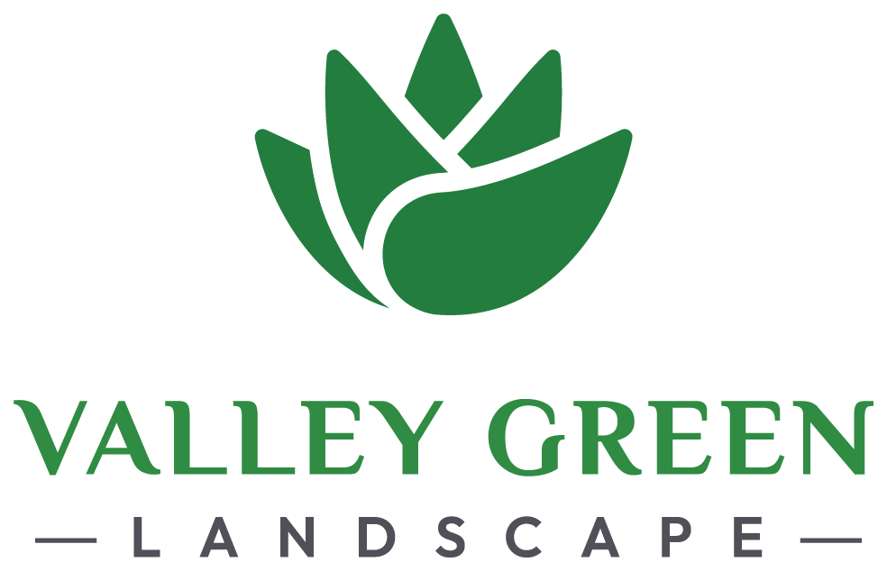
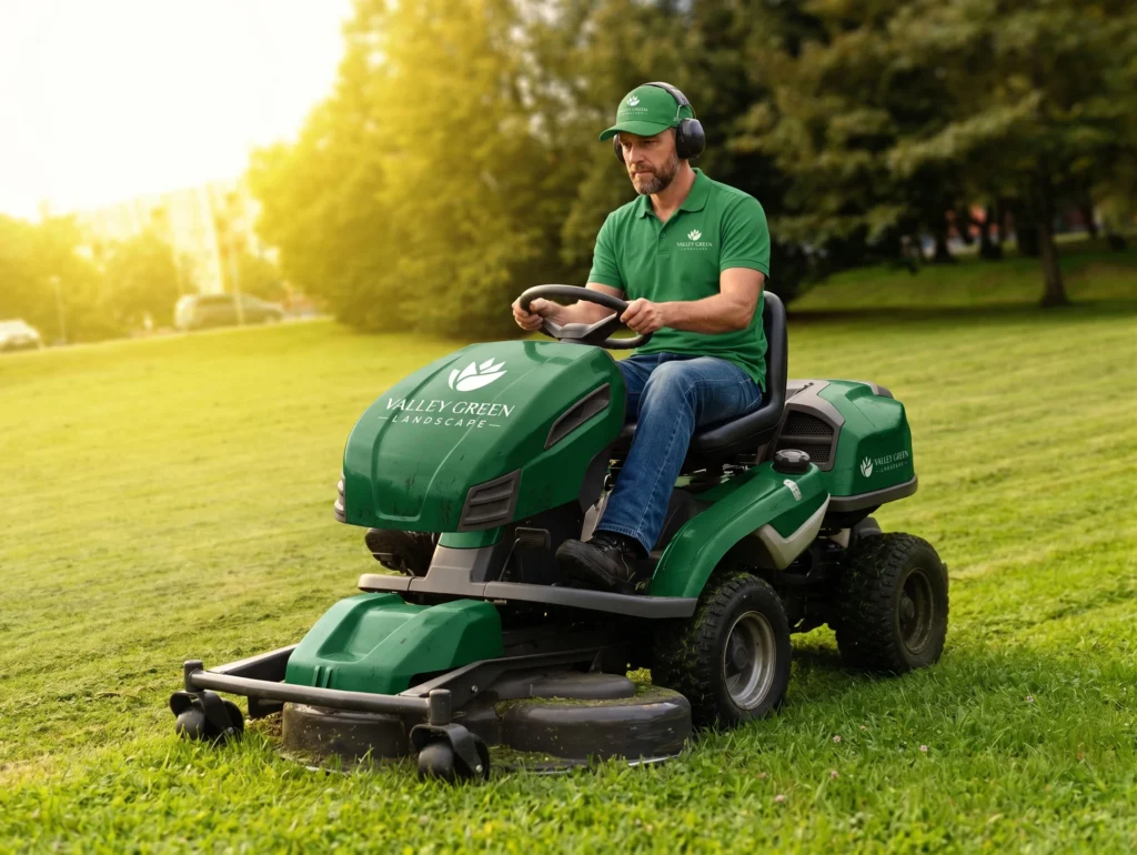
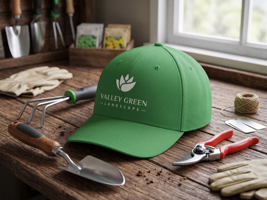
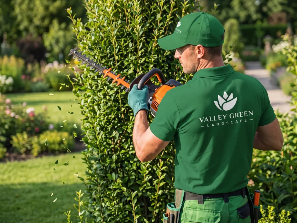
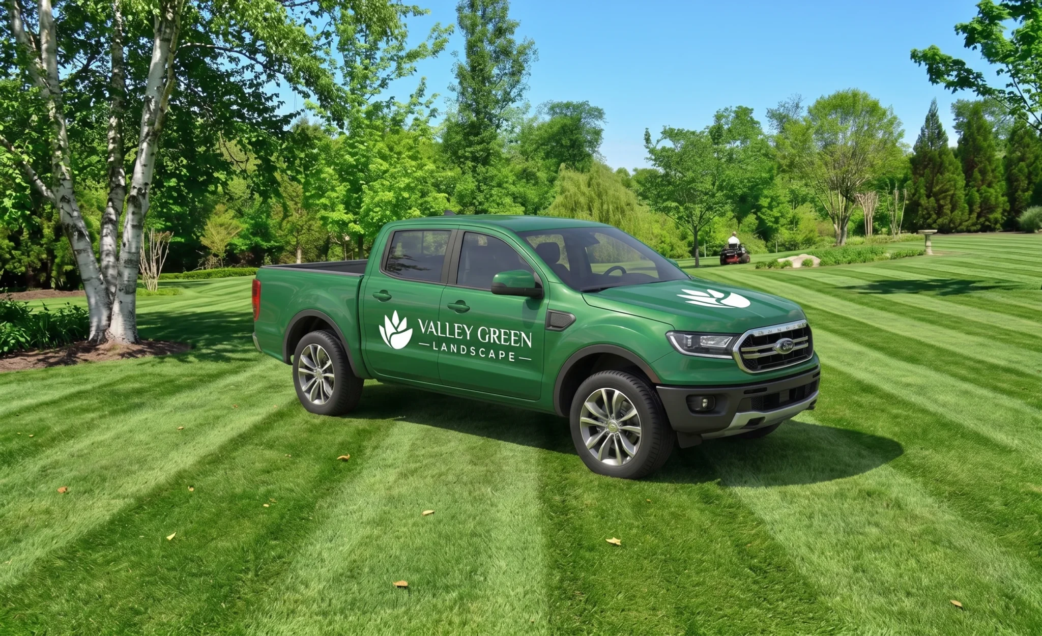
Starting from scratch, I deliberately avoided cliché saguaros and generic palm trees. Instead, I drew inspiration directly from the Agave victoriae-reginae. I began sketching geometric abstractions of its highly symmetrical, tightly packed rosette. My goal was to distill its complex botanical structure into a clean, modern, and minimal vector icon. I meticulously refined the curves to ensure the mark would scale flawlessly from a tiny website favicon up to a massive truck decal.
Identity
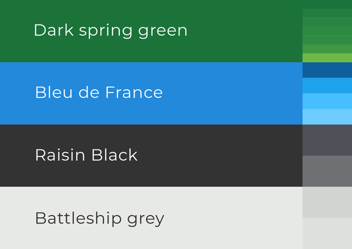
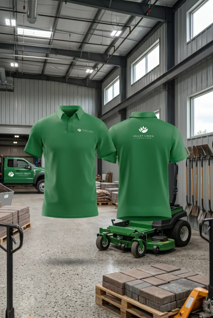
A landscaping brand’s logo strengthens its identity by using natural tones. My primary palette relies on “Dark spring green” and deep earthy tones like “Raisin Black” to represent growth, nature, and stability. Green communicates freshness, vitality, and healthy environments, while the dark, grounded tones add reliability and connection to the soil. Together, they visually reinforce my expertise at Valley Green in creating natural, sustainable, and trustworthy outdoor spaces.