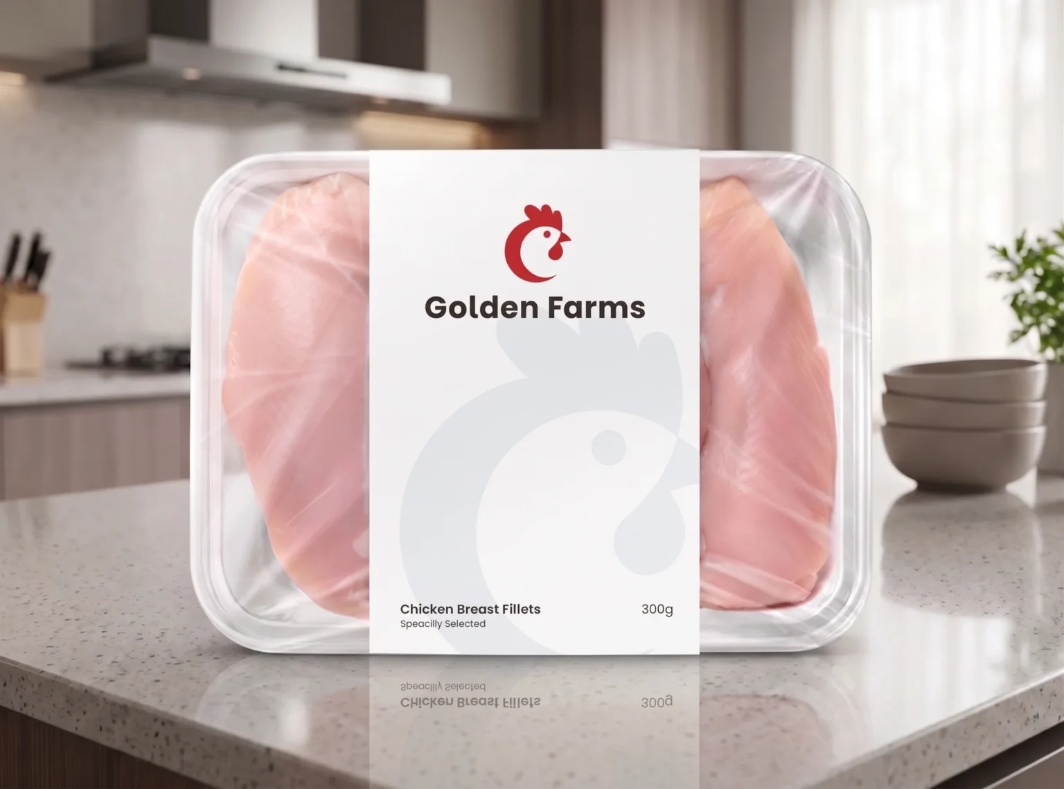
gf_mockup_004

Challenge

The primary challenge was to carve out a unique space for Golden Farms in a congested market dominated by established retail giants and traditional, rustic farmhouse imagery. We needed to convey quality, freshness, and modern reliability for a farm-to-table poultry and egg brand without leaning on overused barn or sun clichés. The brand needed a memorable symbol that suggests trust and quality while feeling fresh and clean. The name “Golden Farms” also demanded a powerful, recognizable mark that instantly connects with consumers on shelves and in stores.

Process

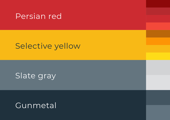
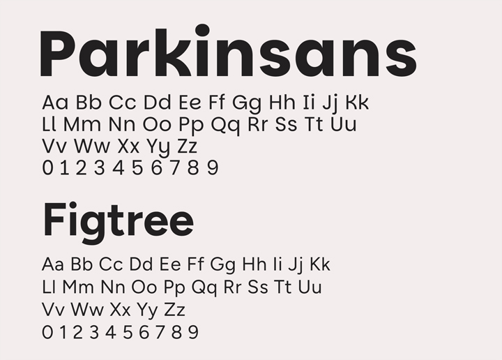
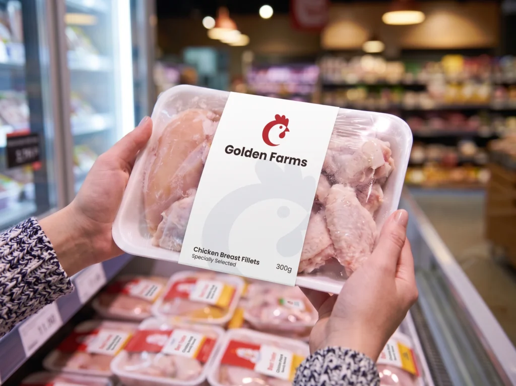
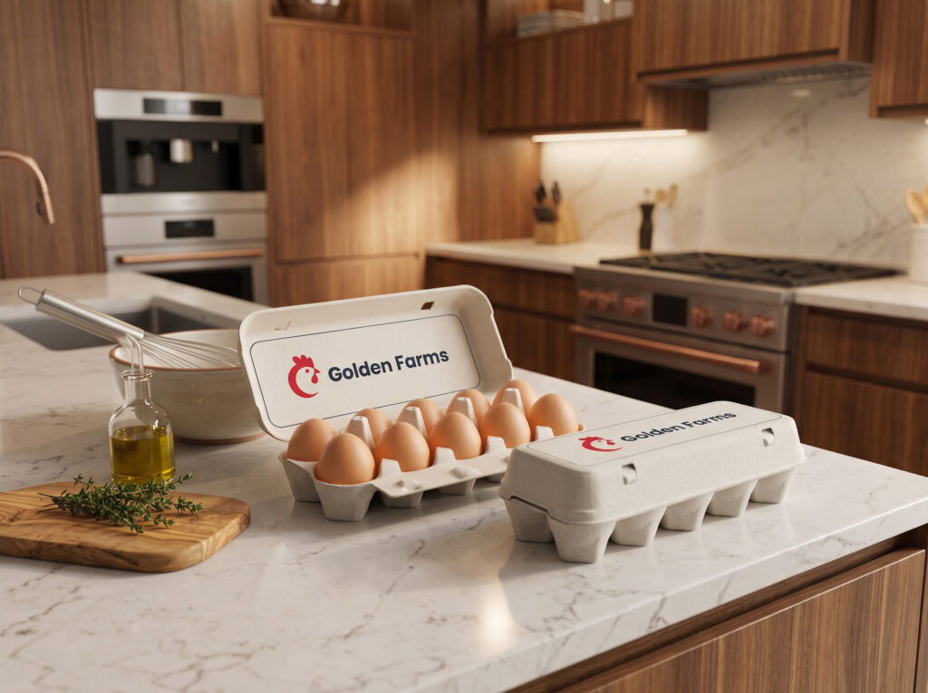
The design process began with extensive conceptualizing for a single, strong central symbol: the simplified, confident chicken profile. This went through rounds of testing to ensure it maintained legibility and impact across diverse formats, from tiny icon sizes to large packaging applications. We meticulously curated a versatile color palette of Persian red, Selective yellow, Slate gray, and Gunmetal, pairing it with a clean typography system using Parkinsans and Figtree. Our visualization stage then applied these core elements to a range of mockups, from poultry trays to egg cartons, demonstrating the system’s inherent flexibility.

Identity

The resulting identity system is centered on a strong, minimalist chicken head icon, rendered in a bold Persian red to convey energy and modernity. This symbol is paired with a clean, confident typeface, Parkinsans. A versatile secondary color system supports the dominant red with vibrant Selective yellow and grounding dark grays. To ensure a consistent visual language, a full suite of illustrative icons was also developed for various poultry products. The overall effect is clean, confident, and memorable.
gf_brand_vlogo_color
gf_brand_hlogo_white
gf_brand_vlogo_color
gf_brand_palette
gf_brand_fonts
gf_brand_icons

Expression

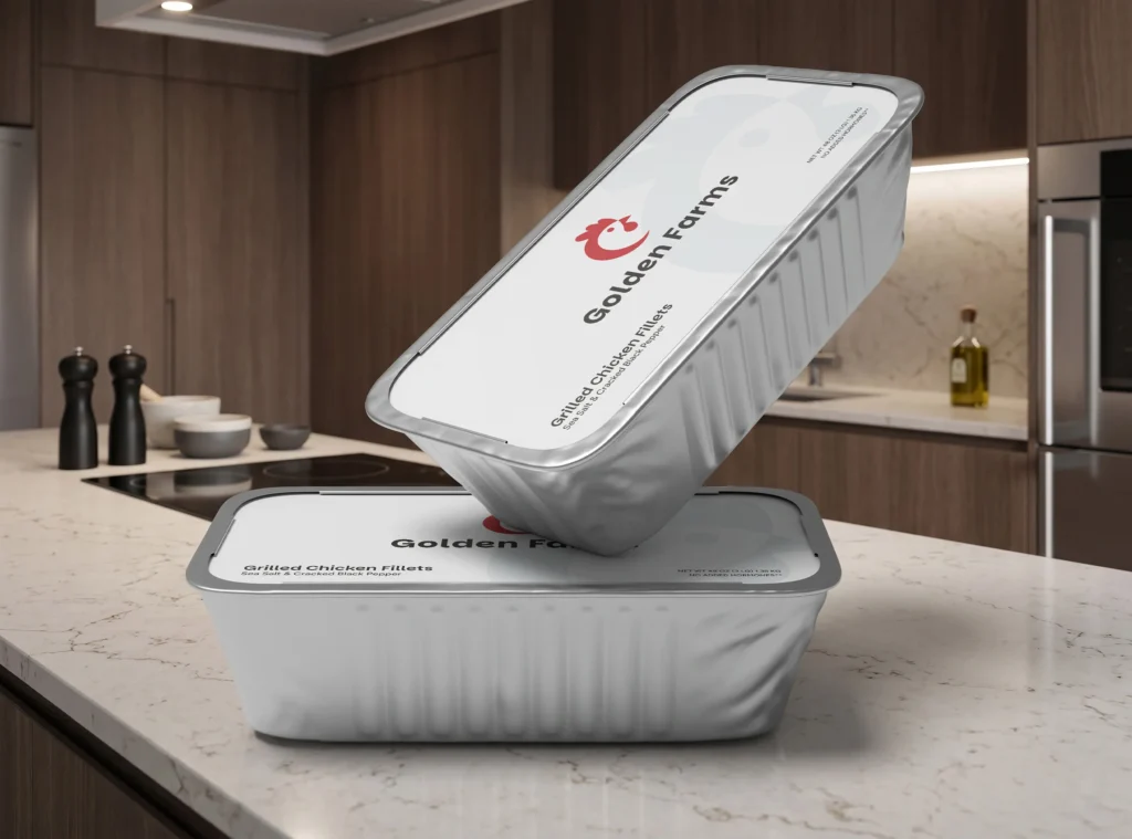
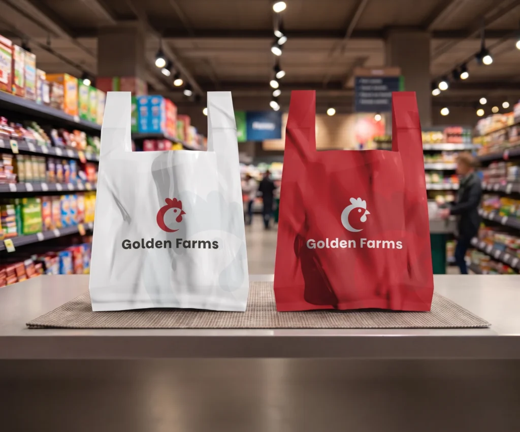
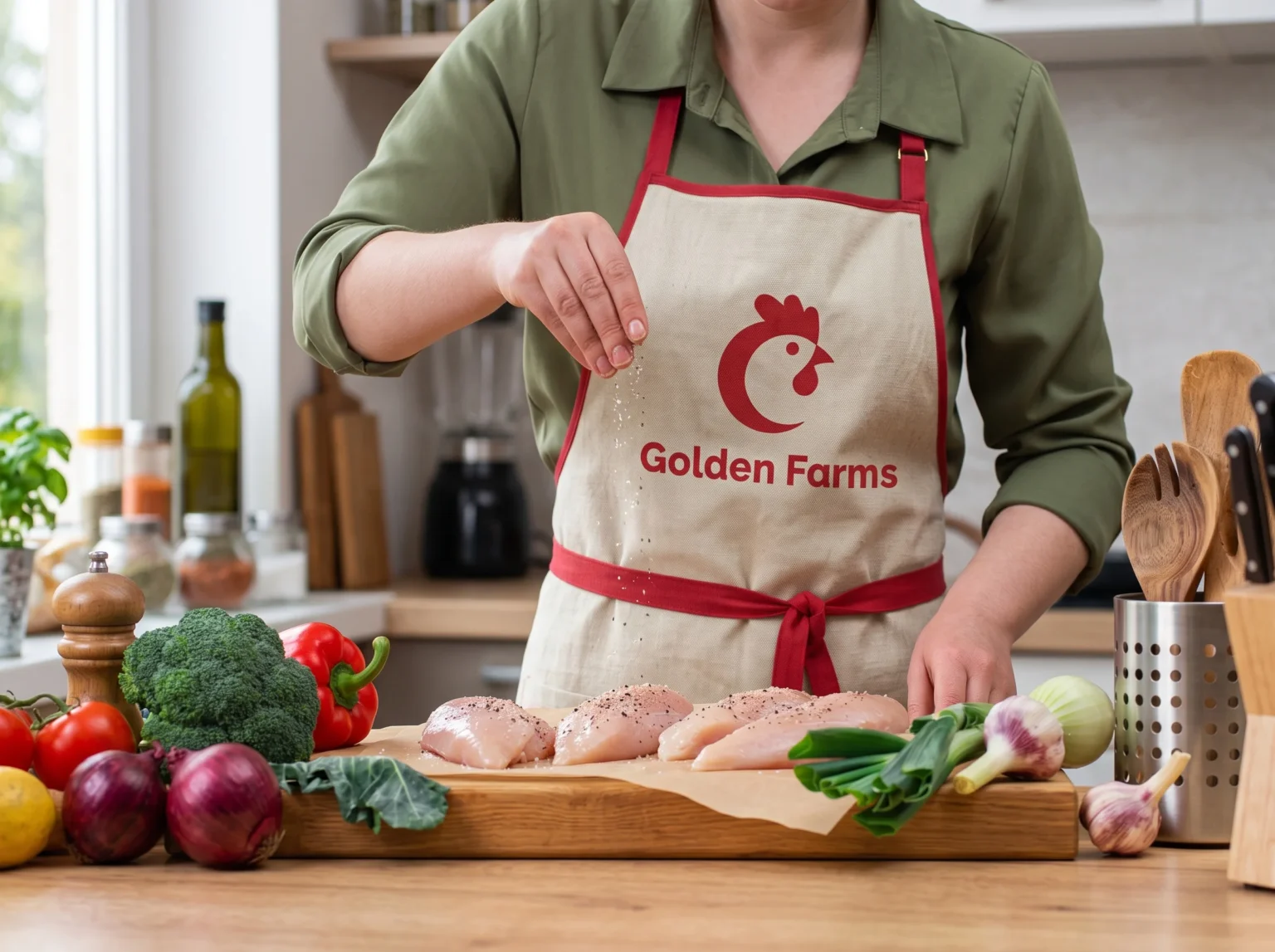
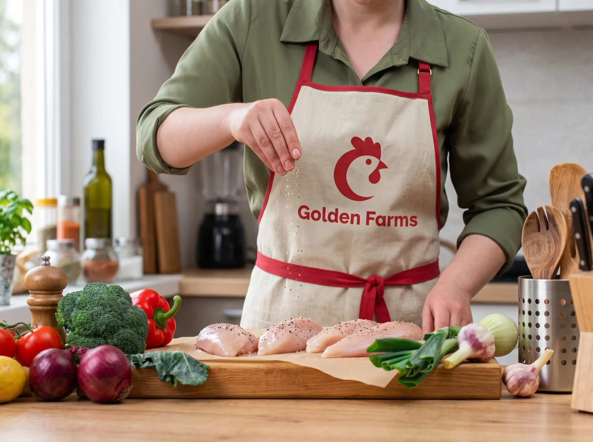
The true power of this identity is seen in its execution across diverse applications. It flexes seamlessly onto clear-tray poultry packaging that lets the fresh product shine, robust egg cartons, clean retail shopping bags in white and red, and brand-aligned staff apparel, such as the aprons for on-site preparation. The identity flows effortlessly between primary production and retail customer experiences, consistently communicating quality and trust in every context.
gf_mockup_001
gf_mockup_007
gf_mockup_005
gf_mockup_003

Strategy

Our deployment strategy focused on high-impact consumer touchpoints first. Primary product packaging was a clear priority, ensuring the new look landed directly in the grocery aisle. Following this, other retail-facing elements like branded shopping bags and staff apparel, such as the aprons, were updated to reinforce the new brand narrative. A phased rollout ensures a consistent brand experience is reinforced at every level, from a single egg carton to large-scale operational environments.
gf_mockup_004
gf_mockup_002

Impact

The final visual overhaul provides Golden Farms with a distinct and confident market position. The simplified, high-contrast logo ensures instant brand recognition on crowded shelves. The cohesive application of the specific color palette and typography builds deep consumer trust, aligning with a reliable, farm-to-table brand promise. Initial feedback indicates improved perceived value and brand recall, successfully positioning the company as a modern leader in the poultry and egg industry.

This website uses cookies

We use cookies to personalize content, provide social media features, and analyze our traffic. We also share information about your use of our site with our analytics partners. You can change your preferences at any time. For more information, please see our Privacy Policy.