Challenge
When I began my collaboration with Josefina, the biggest challenge was translating their deeply intimate, one-on-one styling philosophy into a clear, cohesive brand identity. Their value lies in helping clients build authentic, unique style, which is an intensely personal process. Creating an identity that felt both personal and premium, without being overly prescriptive or traditional, was the central goal. We needed to communicate “curation” and “luxury” in a modern, fresh way.
Process
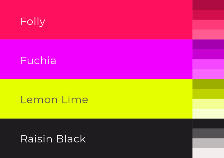
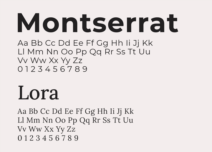
My process was an extensive exploration into the core of the Josefina experience: a blend of high fashion and personalized curation. Starting from scratch, I wanted to find a juxtaposition that embodied this. I arrived at combining classical typography—the elegant Lora serif for the logotype—with a high-octane, unexpected color palette. I landed on pairing a deep charcoal ground with premium gold finishes for architectural elements, and then punctuating it with vibrant magenta, neon lime green, and fuchsia to bring that fashion-forward energy to life. This duality defines the entire system.
Identity
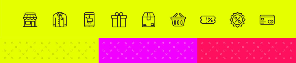
The final identity system is built on this very tension. The core is the “josefina” wordmark in Lora, which exudes approachable luxury. To provide flexibility, we developed multiple versions: a large, high-impact magenta panel and a minimal ‘J’ icon on charcoal. Our primary palette of grounding black and rich gold is complemented by a “capsule” of fashion colors (Ruby, Fuchsia, Lemon Lime) that can be swapped or combined. A suite of custom, linear icons was also designed to support the service across all retail channels.
Expression
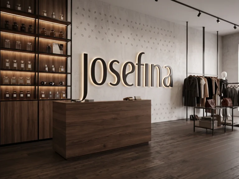
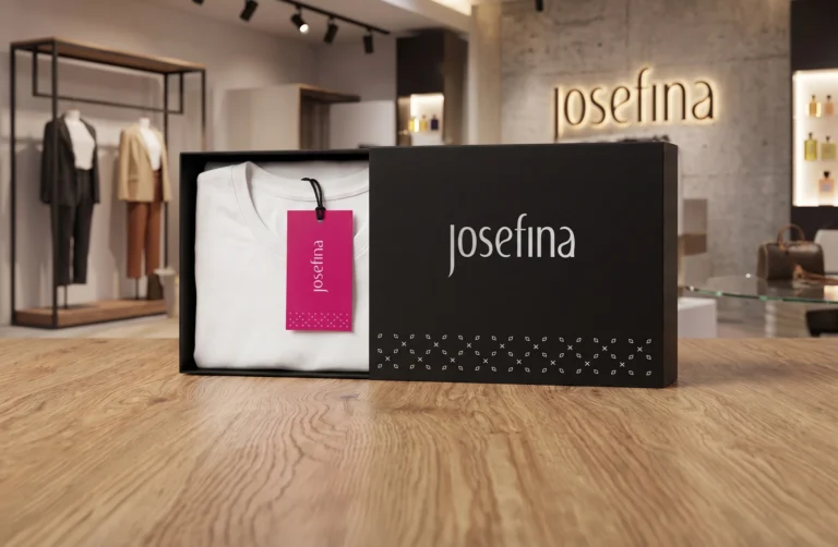
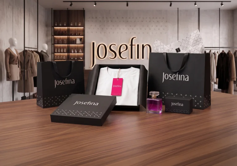
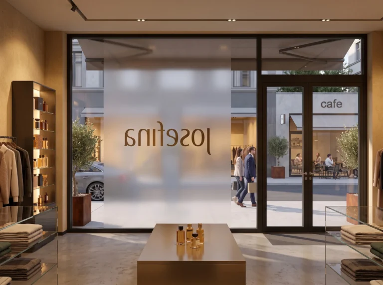
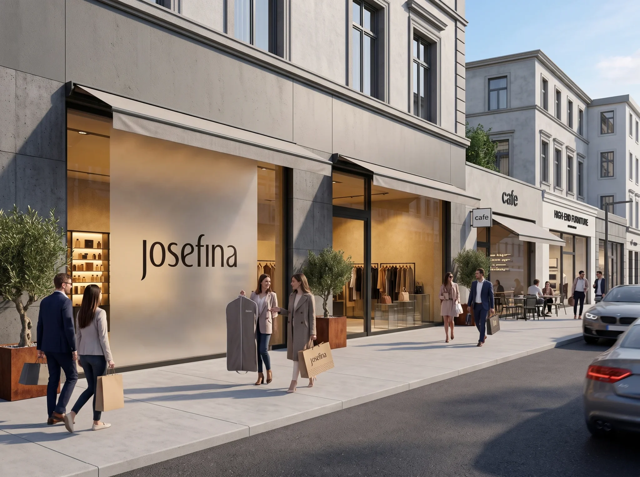
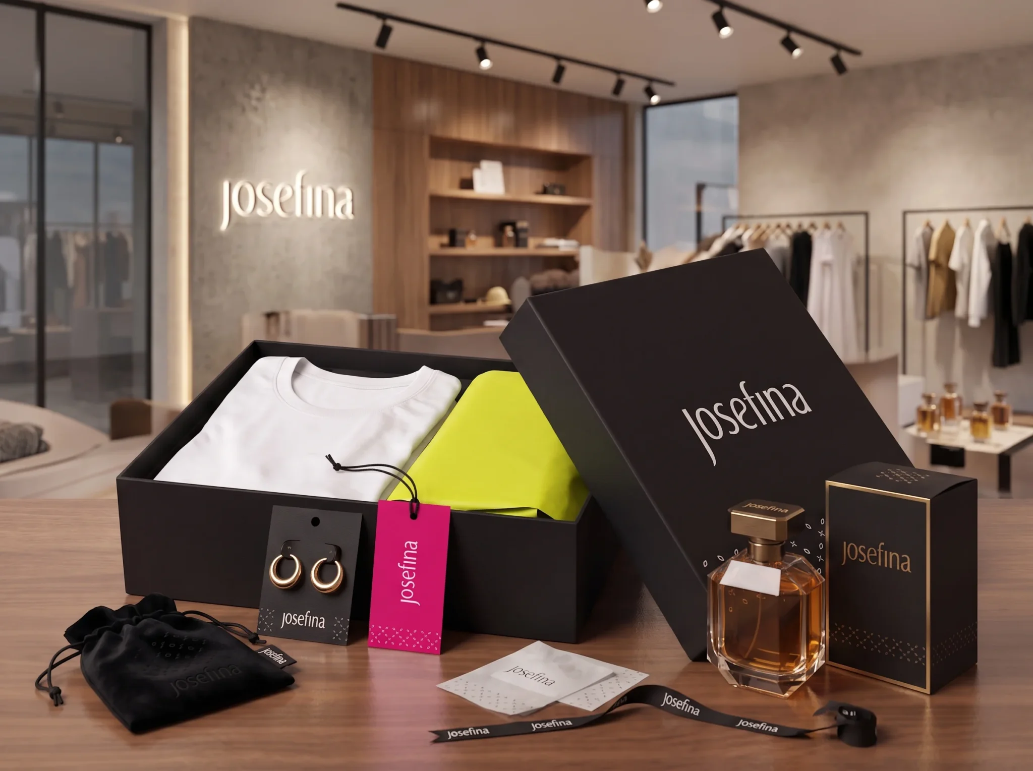
Bringing this identity to life in the physical and digital world was the final step. In the store, premium wood and natural materials serve as a neutral canvas for the quiet luxury of the gold wordmark. Against this, the high-energy palette creates moments of surprise. This is expressed through hot pink jewelry cards and garment tags, black boxes with gold foil and magenta accents, and vibrant perfume branding. Every piece of communication and packaging feels like a cohesive part of the curated styling service, bridging quiet architecture with colorful fashion moments.
Strategy
Our strategy was a phased roll-out designed for impact. We started with the highest-touch physical elements, implementing the new gold signage and in-store fixtures. This was immediately followed by launching the new packaging, which gives clients an elevated, “unboxing” experience for their curated pieces. Digital assets were then aligned, with the vibrant palette and icon set integrated into the website and social media to ensure a seamless client journey from online discovery to in-person styling.
Impact
The new brand identity has profoundly transformed the perception of the store. It immediately signals that Josefina is a high-level, curated fashion experience. The vibrant, modern colors have attracted a younger, more design-conscious client base, while the elegant serif typography reassures existing clients of the store’s expertise. Clients report that the new, high-octane packaging makes the entire service feel like a unique gift to themselves. It’s a cohesive brand world that finally lives up to the incredible personalized service they provide.