quality_mockup_012

Challenge

The main challenge was taking a highly common word like “Quality” and transforming it into a distinctive, memorable brand identity. I needed to communicate trust, technical expertise, and comprehensive automotive care without falling into the usual cliches of greasy wrenches or checkered flags. The goal was to make this repair facility and tire retailer feel modern and highly reliable, ensuring they stand out in a crowded local market.

Process

I started by researching the automotive sector to see where competitors were falling short visually. Knowing “Quality” needed to look pristine, I began sketching typographic logos from scratch that felt sturdy and engineered. I developed a bold, wide wordmark and paired it with a clean “Q” monogram for quick recognition. From there, I expanded the visual language, building custom icons and selecting a robust color palette to anchor the brand.

Identity

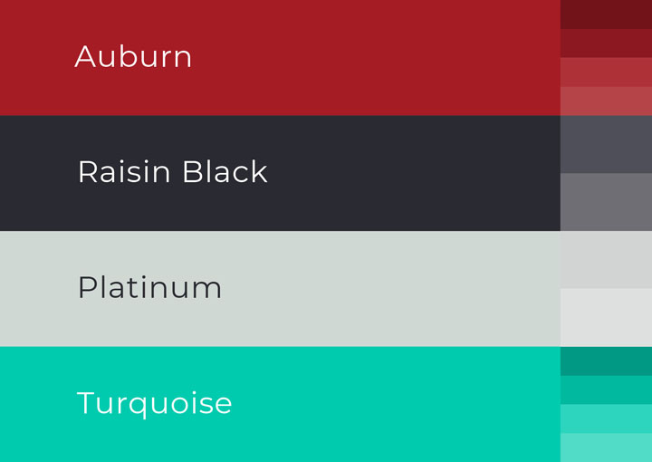
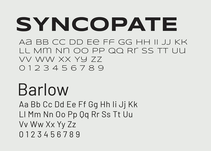
For the core identity, I chose the “Syncopate” font to give the logo an engineered, high-tech stance, paired with “Barlow” for highly readable supporting text. The color palette is intentionally striking: “Auburn” red and “Raisin Black” evoke automotive strength, while “Platinum” and a pop of “Turquoise” add a modern edge. I also designed a custom, minimalist iconography set to represent their specific services like diagnostics and suspension.

quality_brand_logo_hcolor
quality_brand_logo_hgradient
quality_brand_icon_white
quality_brand_palette
quality_brand_fonts
quality_brand_icons

Expression

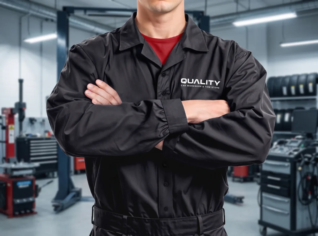
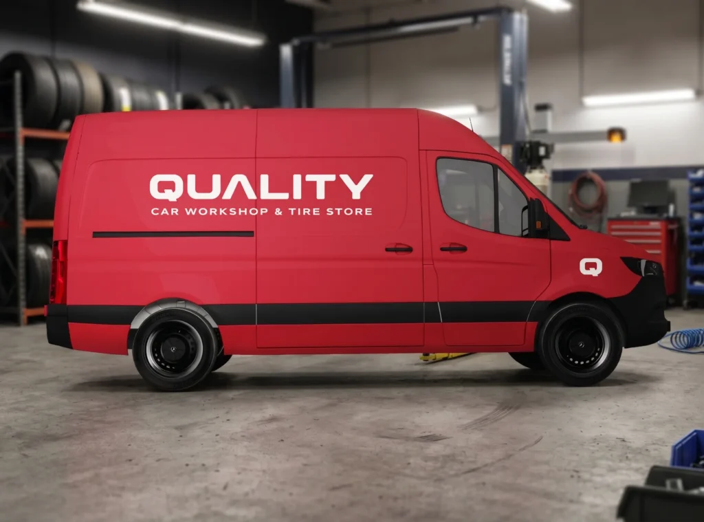
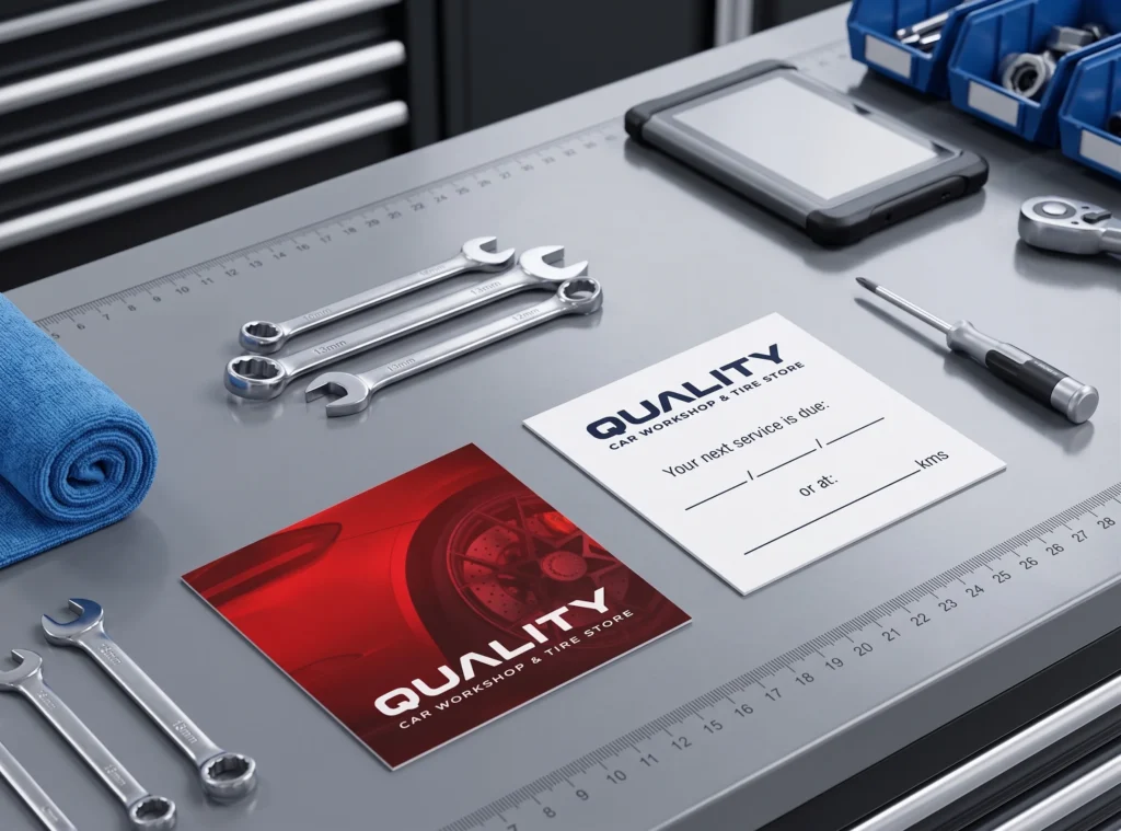
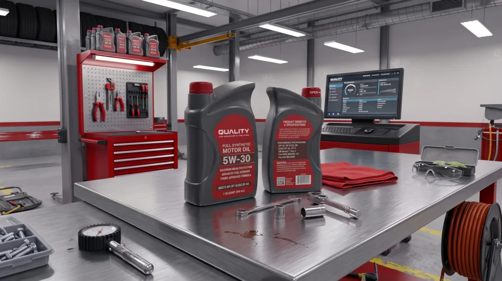
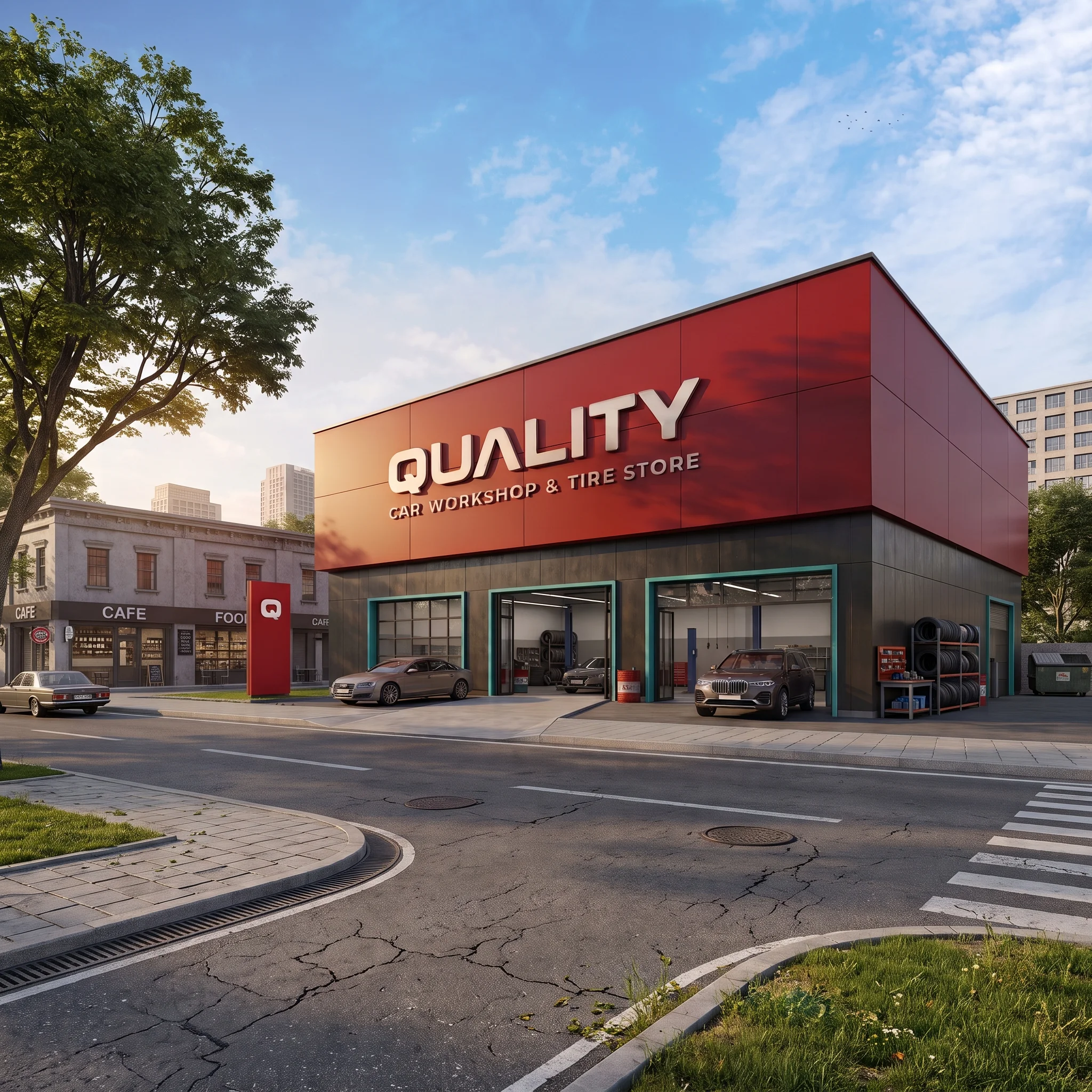
To bring the brand to life, I applied the new identity across various physical touchpoints. I designed sleek, dark mechanic uniforms that instantly make the staff look like trusted professionals. The bright Auburn red was utilized heavily on the service vans to create a striking, moving billboard. I also carried this clean, cohesive aesthetic into everyday practical items, like the service reminder cards and branded motor oil packaging.

quality_mockup_003
quality_mockup_004
quality_mockup_005
quality_mockup_013

Strategy

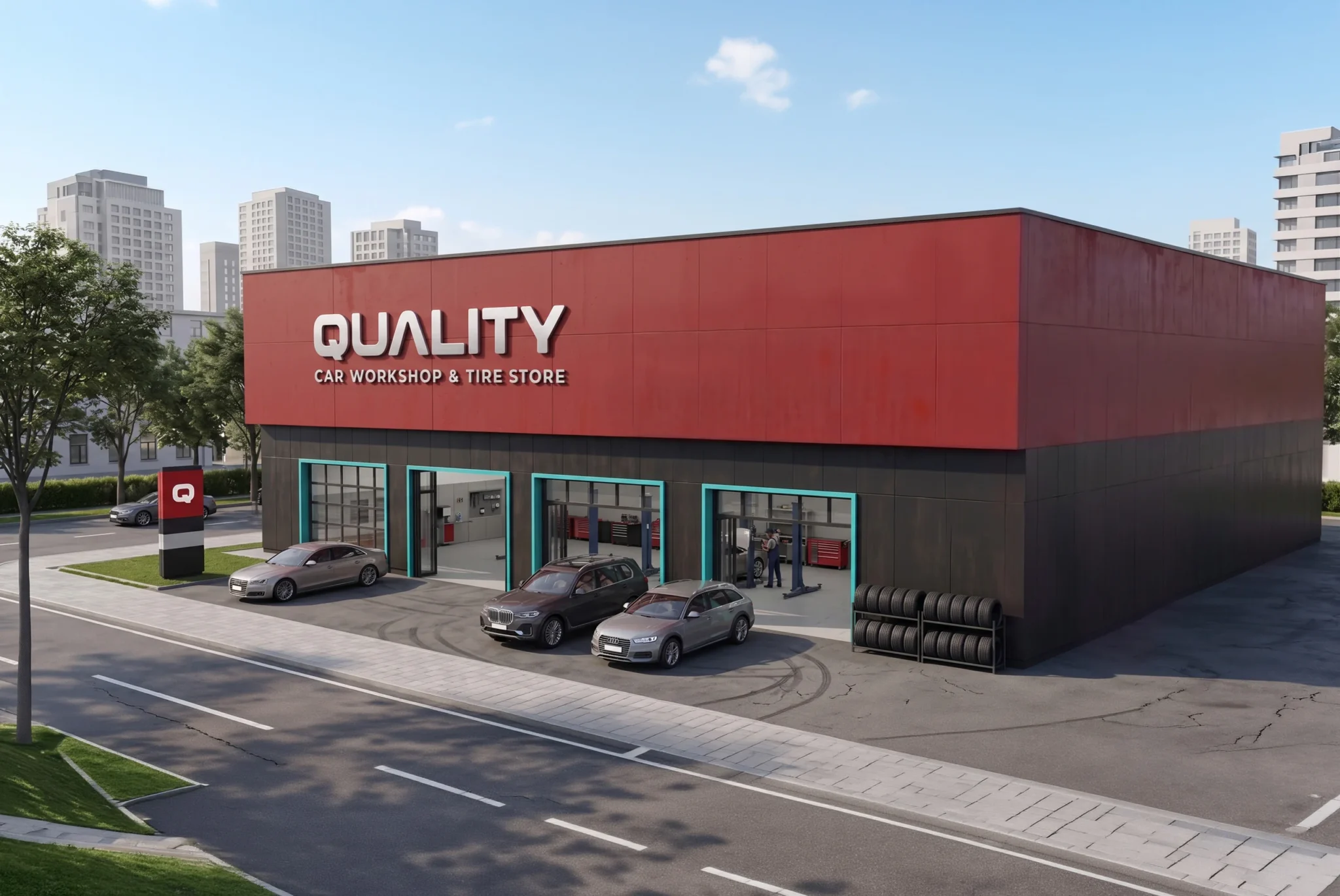
Rolling out the brand required a phased approach to ensure consistency. We started with the physical shop environment, upgrading the signage and employee uniforms to immediately signal the new standard of service to returning customers. Next, we deployed the branded service vehicles and updated all print materials. The final phase involved launching the digital assets, ensuring their online presence mirrored the new, premium in-store experience.

quality_mockup_010

Impact

The new identity completely transformed how the business is perceived. By elevating the visual language, “Quality” no longer just sounds like a promise; it looks like one. The modern, clean aesthetic attracts a broader demographic, including premium vehicle owners seeking reliable diagnostics. Ultimately, the cohesive branding helped justify their competitive pricing, built instant trust, and created a strong foundation for future retail expansion.

This website uses cookies

We use cookies to personalize content, provide social media features, and analyze our traffic. We also share information about your use of our site with our analytics partners. You can change your preferences at any time. For more information, please see our Privacy Policy.